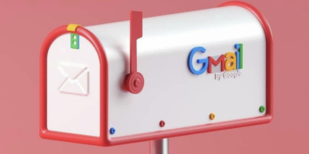
Google Creates New ‘Inbox Zero’ Design
- Jan 18, 2022

Most people nowadays use Gmail all the time, but the minority has ever seen an inbox zero graphics. Inbox zero design appears when you don’t have any messages. It can be hard to imagine that the inbox can be empty. Even when you create your email address, Google sends you the first message, so you can’t see the inbox in its zero state. That’s why most users don’t know that it exists and has special graphics.
Recently, when there were no letters in your inbox, a girl reading a book appeared. The style was very minimalistic, for example, she didn't have eyes. The girl was just smiling and reading a book, and it looked like she was resting. Maybe, Google wanted to say that now you have done all your work, and you can have some time for yourself. She was in the park or the garden, and the weather was sunny, so it made this picture very positive. There were the words “You’ve finished! Nothing in Primary”.
Now Google decided to change the graphics. It is unlikely that you will ever see this new picture, but the company continues to improve even the smallest details. Instead of the resting girl, there are empty boxes with a small flag on them. All your boxes are empty now, and you can celebrate it with a flag. The boxes look like shelves that are common for offices or something like that. The main idea is still the same: you’re now free of your work. The inscription says: “You’re all done! Nothing in Primary.”
The reason why Gmail changed the inbox zero design now of all times is not clear. However, it looks interesting and simple, so there is nothing wrong with the new graphics. The only minus is that a few people will ever see this picture in their inboxes. Have you ever cleaned your inbox completely? Please share your experience with us in the section below.
- Previous Guide New Farmtronics Mod With Bots in Stardew Valley
- Next Guide Instagram Tests Vertical Scrolling Design for Stories


